Bondi Sands
Bondi Sands is an Australian based skincare and self tanning brand. In this brief, I was tasked with creating a brand extention for Bondi Sands which included two seprate products, utilizing at least one complex dieline.
The project ‘problem’ is how would I create a packaging design within the Bondi Sands guidelines.
Research
Target Audience
Geographic
The target for Bondi Sands would be people who reside in Australia, and more often than not live within a short traveling
distance to chemists. Holistically, these people could be in regional areas but are more likely to come from metro areas.
Demographic
The customers will primarily be young adults aged 16-30, heavily female leaning, mid to high income - middle to upper middle class, high school educated, and working in some degree.
Psychographic
Theses customers fall between needing to care somewhat about pricing to not needing to at all, but they all have values of quality products with positive impacts - such as ethical values.
Behavioral
Hobbies of these consumers may be tanning, beach going, shopping, and may be interested in skincare, beauty and self care habits. They prefer products that they trust are working, and are good for them.
Positioning
Bondi Sand’s sunscreen range costs between $17 (75ml) to $28 (500ml), which, when compared to product found at Priceline, is in the lower end of the premium product price range. The brand also offers a money back guarantee for products less than 50% used, is 100% Australian owned and operated, and their commitment to sustainability, all also reinforce that this product is premium.
Existing Design

Competitors
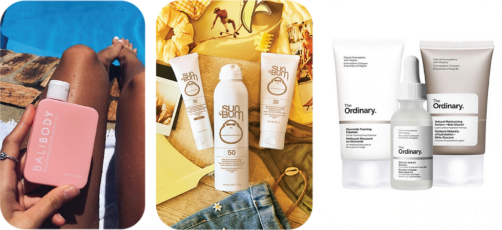
The Ordinary
The Ordinary has a very minimalist mostly black, white, and grey theming of their products, with white and slightly off white being their primary colours. The Ordinary exclusively uses sans serif fonts. They have a range of different products, though their main focus is skincare.
Sun Bum
As opposed to The Ordinary, Sun Bum’s visual identity is a lot more complex and fun. The brand colours focus most on browns, yellows and whites. Their brand identity is heavily influenced by 70’s/80’s retro themes, which comes through in the shade of yellow chosen for their mascot. They also use a lot more playful display fonts through their brand, which can be seen through their logos. Sun Bum focus mostly on their sunscreen range, though they also sell self tan products.
Bali Body
Bali Body’s visual identity tends to encapsulate more colours and looks, meaning they are able to have a bigger range of styles and colours to work with. Their key brand colour is a light tan, as seen above. They use capital letters in sans serif fonts often, and will use serif fonts to highlight key words, though sparingly, and yet also employ minimalism, but in a more bold way than The Ordinary. Their branding also has a somewhat vintage feel, but unlike Sun Bum’s, it is not specific to a decade. The brand is known mostly for their self tanners, but they also sell sun care (such as SPF) and skincare.
Design Planning
Moodboard

Design Inspiration

Sketching

After completing my preliminary research, I developed three ideas for each FOP (Front of Pack) and BOP (Back of Pack).
Design Development

To begin my design development, I experimented with the three concepts I had sketched out. Of these three, I disliked the use of the orange, and instead preferred the visuals of the sand to reflect the beach feel. I felt that the 'Beach' design (bottom right) was my strongest concept, and thus continued in that direction.
With that decision made, I then began designing for the curl spray dieline.

Feedback

I received feedback that the sand and shells were too much and taking away from the premium feel of my product. I was also instructed to make a proper product name for both products.

I was again told that my designs were too sand heavy and to tone that down further. The starfish and shell were also of very differing sizes, and thus I tried equalizing them.

In these, I was told to try a shape behind the images to make them feel less flat.
Final Design
Print Ready Files


Mockups


Project Outcome
I produced two packaging items that met Australian shelving guidelines. In this process, I strengthened my design abilities through developing complex dielines, applying a pre-exisiting brand voice/feel to a product and creating realistic mockups.